EBMS Tickets
| Issue Number | 764 |
|---|---|
| Summary | Editing Toolbar is different on DEV |
| Created | 2023-04-18 16:43:05 |
| Issue Type | Task |
| Submitted By | Shields, Victoria (NIH/NCI) [E] |
| Assigned To | Kline, Bob (NIH/NCI) [C] |
| Status | Closed |
| Resolved | 2023-04-18 17:47:23 |
| Resolution | Fixed |
| Path | /home/bkline/backups/jira/oceebms/issue.343767 |
I was trying to edit the Policies and Procedures page and noticed that in the edit function, the tool bar on the DEV site is different than the toolbar on PROD. The DEV toolbar doesn’t have as many icons as PROD. And the LINK function on the DEV toolbar brings up a different linking page.
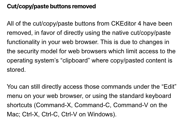
The rich text editing interface has been transitioned to ckeditor5 as part of OCEEBMS-738. The toolbar did have some missing buttons. I have restored those which are still available with ckeditor5. The ones which are no longer available are the cut/copy/paste operations which are duplicated by the context (right-click) menu, and are also available using the popular keyboard shortcuts (Ctrl-X, Ctrl-C, Ctrl-V). Please review the toolbar on DEV and let me know if the ordering of the buttons or the placement of divider bars should be altered.
Comparing the DEV toolbar to the PROD toolbar, the DEV tool bar is missing the copy, cut, and paste icons. Most importantly, the DEV toolbar doesn't have an unlink button, and the link pop-up is still different (than PROD) and doesn't seem to work.
Comparing the DEV toolbar to the PROD toolbar, the DEV tool bar is missing the copy, cut, and paste icons.
Yes, I noted this in an earlier comment. For more background information:

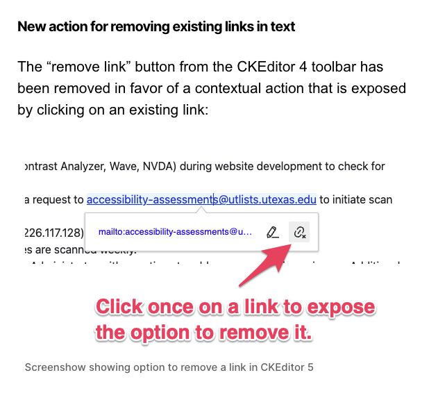
Most importantly, the DEV toolbar doesn't have an unlink button ...
It's just been moved (I'm guessing to save space and create a more compact toolbar?):

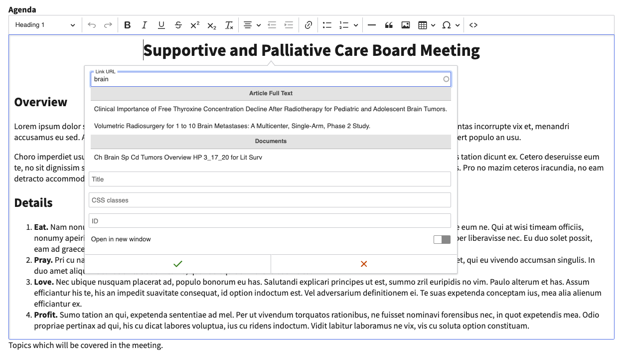
... and the link pop-up is still different (than PROD) and doesn't seem to work.
Yes, I see that it's not working on DEV, though it's working correctly on my development copy of the site (see screenshot below). I'll try to figure that out. The styling is not identical to CKEditor 4 (not much we can do about that) but the functionality should be the same. We will make it so. 😃

Sorry, I totally missed your initial comments about cut/copy/paste. I knew they weren't essential, but was trying to keep the toolbar similar to what we had.
Thanks for continuing to work on the link issues!
I think I figured it out. Please try linking on DEV again and let me know how it goes. You should also be able to see the icon for deleting a link once you select and click on it.
The unlinking icon is now showing up when I click a linked document, and the linking tool/pop-up is now working. Hooray!
The linking tool on DEV is quite different than the one on PROD. It works differently (there's an extra click to confirm the file after you choose it), but we can obviously get used to that. The link field is also quite a bit smaller on DEV, but it looks like it will expand a bit if you fill it and keep typing, then the words will eventually scroll. If we could make it a bit bigger I think that would be preferable, but I know we have less control over some of the calendar pages. For reference, the link field on DEV is about 2 1/2 inches on my screen (i.e., we have about 2 1/2 inches of space to type the title), whereas the link field on PROD is about 6 inches. We do occasionally have long titles and it can be helpful to see more words to confirm that we are linking the correct title. Do you have any control over the size?
Are you talking about the size of the form for an existing link? For a link that's being newly created, I am seeing a width much larger than the values you gave, once I start typing and the matches are displayed. If the latter, then we need to figure out why what you're seeing differs from what I'm seeing. If the former, the answer is I don't really know. I can do some investigation, and it's possible there's a straightforward way to customize the width. It's also possible that there isn't a straightforward way and the only way to do it is by trial and error without really understanding how what we do to achieve the result we're looking for might result in unintended (and possibly hard to detect) side effects. Unless we're really, really lucky and I stumble across the straightforward (and well-documented) way to do it, I would recommend we tackle this question in a separate ticket for a later release.
~vshields This is one of the last tickets needing attention before I can package up the Fiordland release. Am I correct in my understanding that the linking dialog width is the only outstanding loose end for the ticket? We'll want to clarify exactly which of the steps of the process we're talking about (see my previous comment).
I am talking about the form that pops up when you click the link icon. The field on that form where you enter the title of the document you want to link is very small and you can only see a few words of the title. It's definitely not a show stopper, I just wondered if it was an easy fix (or a fix at all).
Robin and I are meeting soon to look over the Fiordland tickets and make sure we're in a good stopping place, so I will touch base with you after we meet.
It's possible we're seeing different behavior, so I think a shared screen session would be useful. Are you available to do that some time today?
Capturing for the record the conversations with ~vshields in which we verified that we still have all the functionality provided by the CKEditor 4 interface, though it doesn't look exactly the same (and the clipboard functionality is now only available using different methods than toolbar buttons).
Verified on QA (toolbar is still very different than PROD toolbar, but all the functionality we need is there).
Verified on PROD.
| File Name | Posted | User |
|---|---|---|
| image-2023-04-20-12-42-54-785.png | 2023-04-20 12:42:55 | Kline, Bob (NIH/NCI) [C] |
| image-2023-04-20-12-44-54-667.png | 2023-04-20 12:44:55 | Kline, Bob (NIH/NCI) [C] |
| image-2023-04-20-13-01-57-186.png | 2023-04-20 13:01:58 | Kline, Bob (NIH/NCI) [C] |
Elapsed: 0:00:00.000362