CDR Tickets
| Issue Number | 4873 |
|---|---|
| Summary | [Glossary] GTC Full QC report - match language and audience display |
| Created | 2020-09-03 10:06:37 |
| Issue Type | Improvement |
| Submitted By | Osei-Poku, William (NIH/NCI) [C] |
| Assigned To | Englisch, Volker (NIH/NCI) [C] |
| Status | Closed |
| Resolved | 2020-09-14 17:04:35 |
| Resolution | Fixed |
| Path | /home/bkline/backups/jira/ocecdr/issue.274078 |
Please modify the GTC Full QC side by side report option to match the audience of definitions so that the English HP and Patient match the Spanish HP and patient. It looks like currently it displays it exactly as they are in the document but there is no particular order in the documents.
~oseipokuw, since there
is no specific order in the document and you'd like the sections to be
matched I have to ask:
In which order would you like the sections to be displayed? First HP,
then patient or vise versa?
Question for ~oseipokuw and ~bkline:
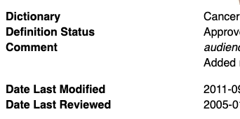
The label for the Comment row is displayed in
bold while all other labels are displayed in a normal
font weight. Is this by design? I would like to display all labels the
same.
For my information, the Comment row is created via the "Comment" template in the filter "Glossary Term Definition Update".
I don't see the difference you're describing. please provide screen shot and URLs.

I was running the side-by-side report from XMetaL (screenshot attached)
URL, please.
https://cdr-dev.cancer.gov/cgi-bin/cdr/GlossaryConceptFull.py?Session=guest&DocId=CDR0000621561
It seems to be handled differently by different browsers. In IE, the extra bold tag increases the font-weight but that's not the case in Chrome or Safari. However, the users are all running IE when initiating the report from XMetaL. Removing the bold tag would solve the problem.
A more general solution would be to add our own CSS rule to override the IE styling.
b, b b, b b b, b b b b, b b b b b { font-weight: bold; }And of course, for new reports, it's better to use CSS rules instead of formatting elements anyway.
.label { font-weight: bold; }A more general solution would be to add our own CSS rule to override the IE styling.
That is exactly why I was asking. Adding a CSS rule to disable the bold display seems dirty. I can see myself scratching my head trying to understand why the bold tag doesn't display the text in bold if I came across that code. Therefore, I was asking if there was a reason why the Comment label is shown with surrounding bold tags since other labels are not. It would be just as simple to remove the bold tags from the XSLT template creating the HTML as it would to setup a CSS rule.
The rule I'm suggesting doesn't prevent
<b>..</b> markup from rendering the text as
bold, it just prevents IE from adding extra bolding. I think you should
do both.
If there's already style rules in place to have the labels displayed bold, then remove the unnecessary
<b>..</b>markup.Add a the CSS rule to make IE behave the way other browsers do.
The following script has been modified to display the definitions of the report in a particular order (Patient first, then HP):
GlossaryConceptFull.py
https://github.com/NCIOCPL/cdr-admin/commit/22114f5
I also removed the unnecessary <b>..</b> markup from the Comment label which was create with the following filter:
CDR598376.xml - Glossary Term Definition Update
https://github.com/NCIOCPL/cdr-server/commit/f668ae4
This is ready for review on DEV.
Verified on DEV. Thanks!
Verified on QA. Thanks!
Verified on PROD. Thanks!
| File Name | Posted | User |
|---|---|---|
| image-2020-09-12-12-53-26-862.png | 2020-09-12 12:53:27 | Kline, Bob (NIH/NCI) [C] |
| Screen Shot 2020-09-14 at 10.14.22 AM.png | 2020-09-14 10:18:20 | Englisch, Volker (NIH/NCI) [C] |
Elapsed: 0:00:00.002007