CDR Tickets
| Issue Number | 4959 |
|---|---|
| Summary | Modify Glossifier window to add definition |
| Created | 2021-03-15 13:54:00 |
| Issue Type | Improvement |
| Submitted By | Osei-Poku, William (NIH/NCI) [C] |
| Assigned To | Kline, Bob (NIH/NCI) [C] |
| Status | Closed |
| Resolved | 2021-03-30 09:35:40 |
| Resolution | Fixed |
| Path | /home/bkline/backups/jira/ocecdr/issue.286906 |
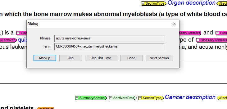
Would it be possible to modify the glossifier window to add the definition of the term that is being glossfied? This would be a good feature to have as in some cases users need to review the definition before glossifying the term but currently it involves several steps. Having the definition in the current glossifier window would be great as it will save users a lot of time.

How can this possibly be a bug? There has never been a requirement to include the definition as part of the glossifier, as far as i am aware.
Sorry about that. I have changed it. It is certainly not a bug. That is one thing I would love see changed in Jira. It remembers the last type you selected and defaults to that type the next time you create a new ticket. It would be nice if it always prompts you to choose a new type like the other fields.
At least Jira lets you change the issue type instead of having to start over.
Added ~duganal to the watchers list for this enhancement request.
Let's nail down at least some of the specifics for the ticket's requirements.
Can we assume that only definitions which match the language and audience of the current summary will be shown?
If the software finds more than one matching definition, can it just show the first one it finds?
Should the software always show the definition (slower, probably more memory intensive), or should a button be added to show the definition on demand (faster)? (You pointed out that the need to see the definition only arises some of the time.)
If an "on-demand" button is used, would we overlay another modal dialog window or redraw the existing dialog window?
Should we fetch all of the glossary definitions the first time it is invoked (slower first response, faster subsequent responses) or fetch them as needed (spreads out the performance hit, reduces memory footprint, thus improving performance)?
Should long definitions be truncated? If so, what should be the limit?
Do you want this ticket to go into Newton?
1. Can we assume that only definitions which match the language and audience of the current summary will be shown?
For the most part, that would be true. However, there are some cases (IACT Summaries) where we link to patient terms even though they are HP summaries.
2.If the software finds more than one matching definition, can it just show the first one it finds?
Displaying all the definitions would be helpful. However if that is not possible, displaying the first two definitions should be good. I think it will be preferred to display the definition that matches the summary audience since that is what will be displayed in the summary on Cancer.gov.
3. Should the software always show the definition (slower, probably more memory intensive), or should a button be added to show the definition on demand (faster)? (You pointed out that the need to see the definition only arises some of the time.)
Using a button should be okay.
4.If an "on-demand" button is used, would we overlay another modal dialog window or redraw the existing dialog window?
What we had in mind was redrawing the existing dialog window.
5.Should we fetch all of the glossary definitions the first time it is invoked (slower first response, faster subsequent responses) or fetch them as needed (spreads out the performance hit, reduces memory footprint, thus improving performance)?
fetch on as as needed basis
6.Should long definitions be truncated? If so, what should be the limit?
We will prefer to see all the definition text if possible.
7.Do you want this ticket to go into Newton?
Yes, that would be really helpful.
Thank you!!
As we discussed yesterday, I have implemented on CDR DEV a solution which brings up the publish preview window for the current glossary term on demand.
Is it possible to control the size and placement of the pub preview window? Each time I click on the Preview button, the Pub Preview window takes over the full screen of my laptop. I can resize it then but I had to do it for each Preview. The glossary doc pub preview data can be displayed in a much smaller window like the attached screenshot and still see all the information.
I don't know, but it wouldn't be part of this ticket.
You might want to try this tip.
That worked. Thanks!
Verified on DEV. Thanks!
Verified on QA. Thanks!
Verified on PROD. Thank you!! Users are very happy with this new feature and are very appreciative as well. Thanks!!
| File Name | Posted | User |
|---|---|---|
| glossifier preview.PNG | 2021-04-27 12:09:47 | Osei-Poku, William (NIH/NCI) [C] |
| image-2021-03-15-13-53-07-552.png | 2021-03-15 13:53:09 | Osei-Poku, William (NIH/NCI) [C] |
Elapsed: 0:00:00.001366