CDR Tickets
| Issue Number | 5312 |
|---|---|
| Summary | Improve CDR administrative UI |
| Created | 2023-12-18 03:41:55 |
| Issue Type | Improvement |
| Submitted By | Kline, Bob (NIH/NCI) [C] |
| Assigned To | Kline, Bob (NIH/NCI) [C] |
| Status | Closed |
| Resolved | 2024-01-04 11:46:41 |
| Resolution | Fixed |
| Path | /home/bkline/backups/jira/ocecdr/issue.372331 |
Overview
A branch has been created to give the the CDR web site a facelift, using the USWDS framework, which is also used by the NCI web site and the EBMS. Improvements have been made to the menus, page appearance, and testing support. The results can be seen at https://nciws-d2019-v.nci.nih.gov.
Advantages
The benefits of this version include the following.
consistent navigation sidebar always available
report output in separate tabs, eliminating dependence on the Back button
common footer with frequently-used links
cleaner, more modern look and feel with familiar layout
flexible, centralized menu structure management
an automated test suite for all pages
more graceful error-handling
dashboard landing page for users with access to multiple menu groups
CDR document search box in the banner
Sample Pages
A few screenshots have been included to illustrate the new layout.
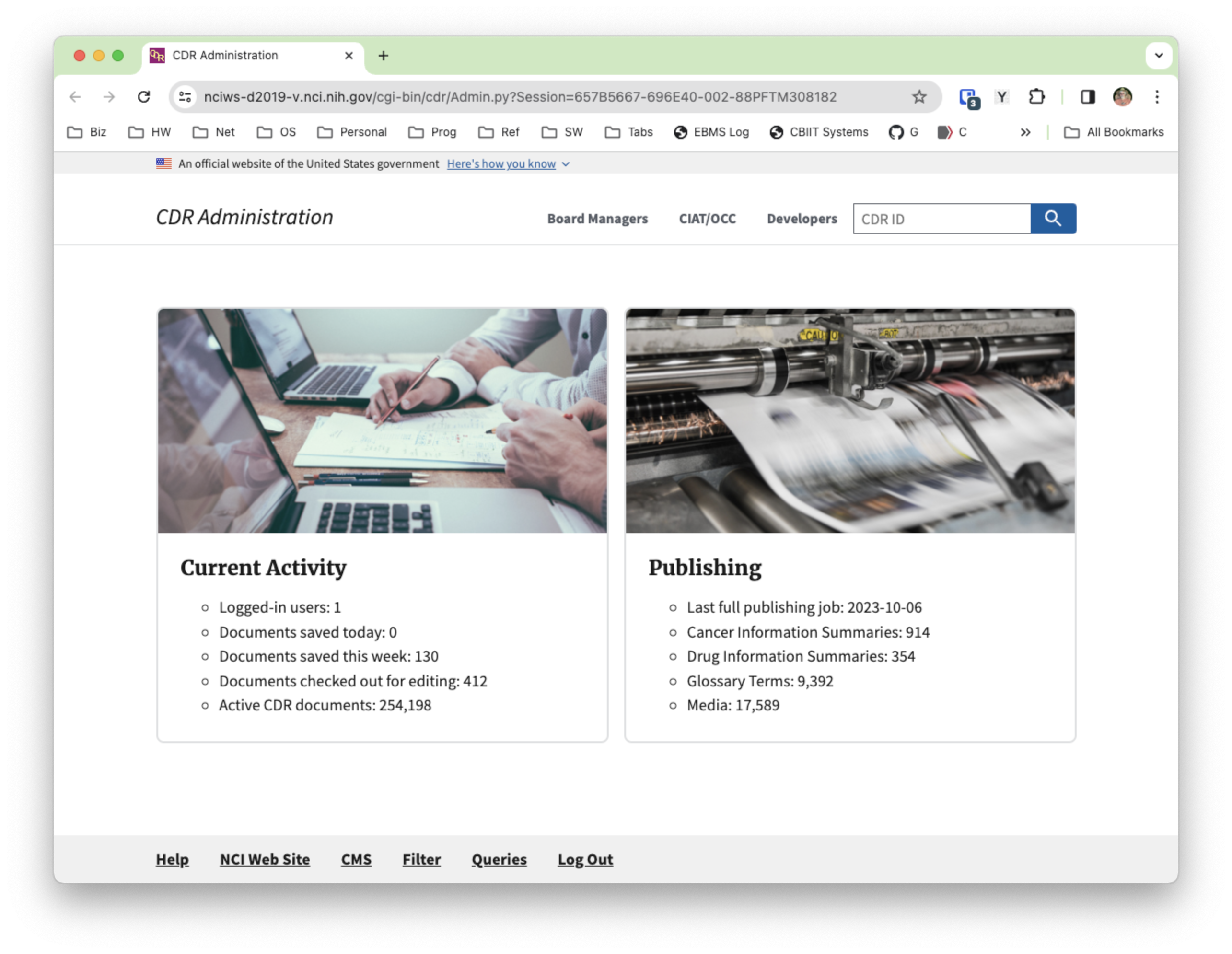
Landing page
For users with access to more than one menu group, the top banner contains a main menu for selecting one of those groups, along with a dashboard showing statistics for current CDR activity.
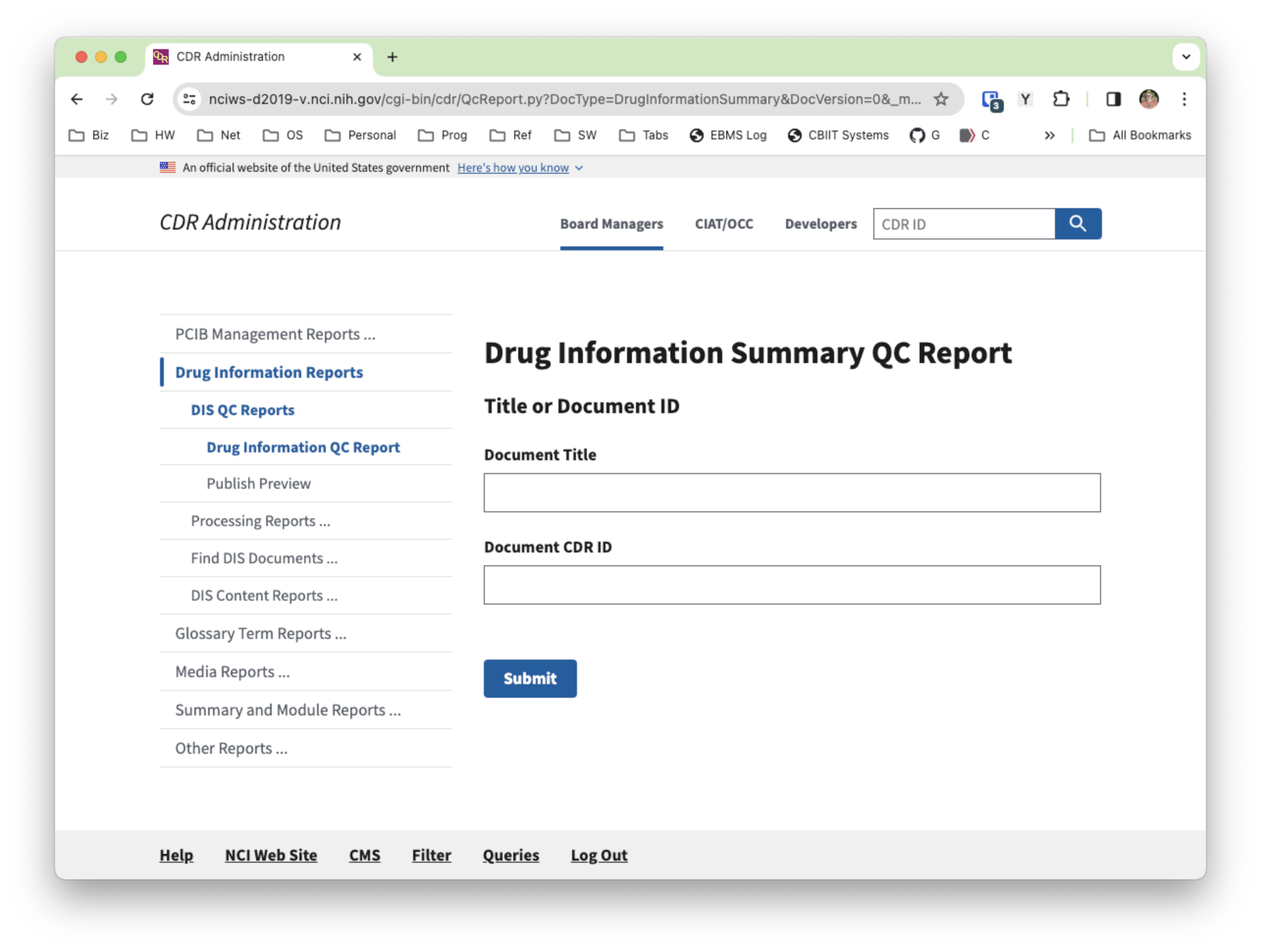
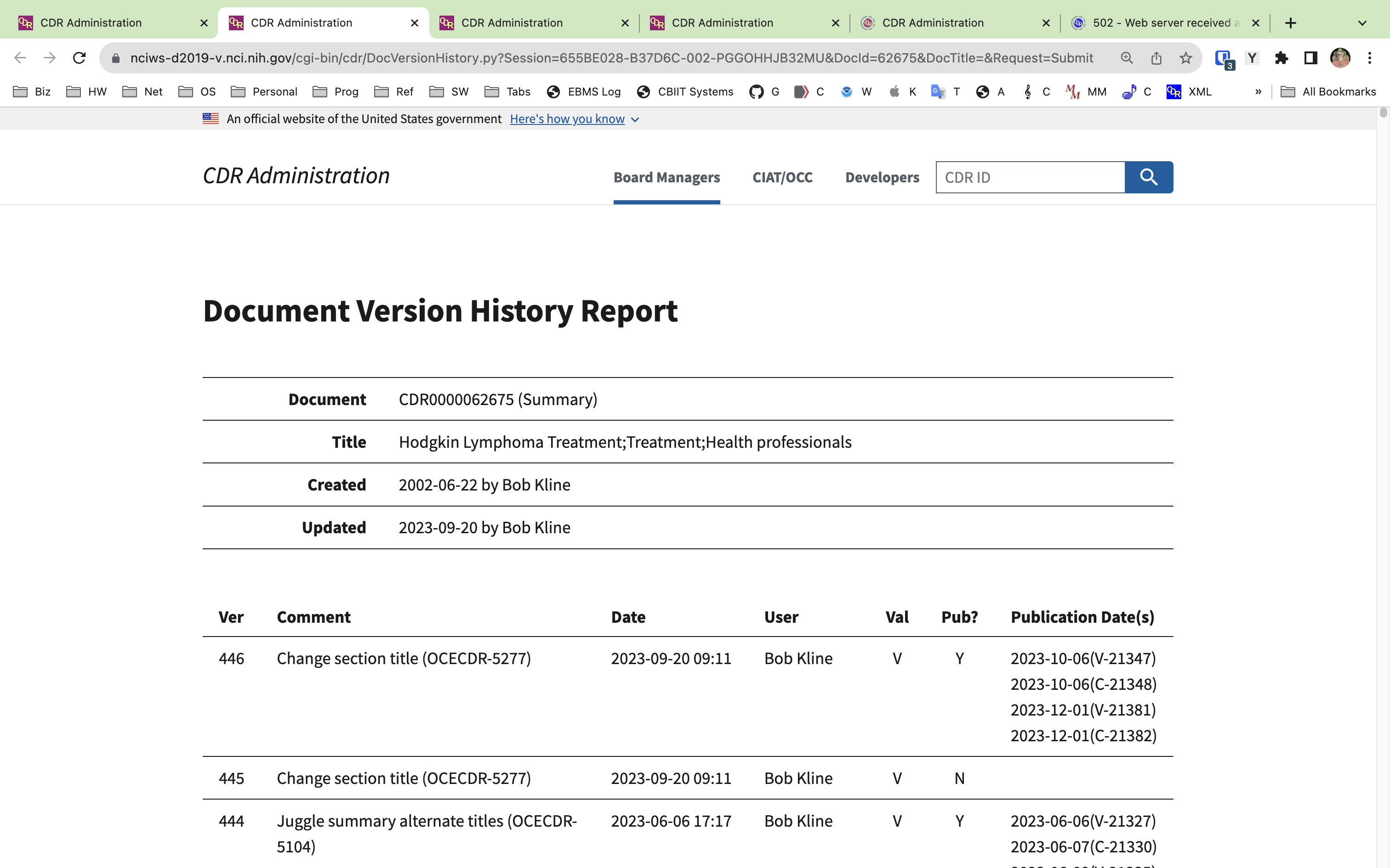
Navigation sidebar
The left portion of the page shows the available reports and utilities for the selected menu group, providing hierarchical context for the currently selected menu item.
Report layouts
Depending on a report's width and on whether it requires a form, there are several layouts available.
In-place report
One or two of the reports are compact enough and require no form for report options that they can be displayed directly, next to the left navigation sidebar.
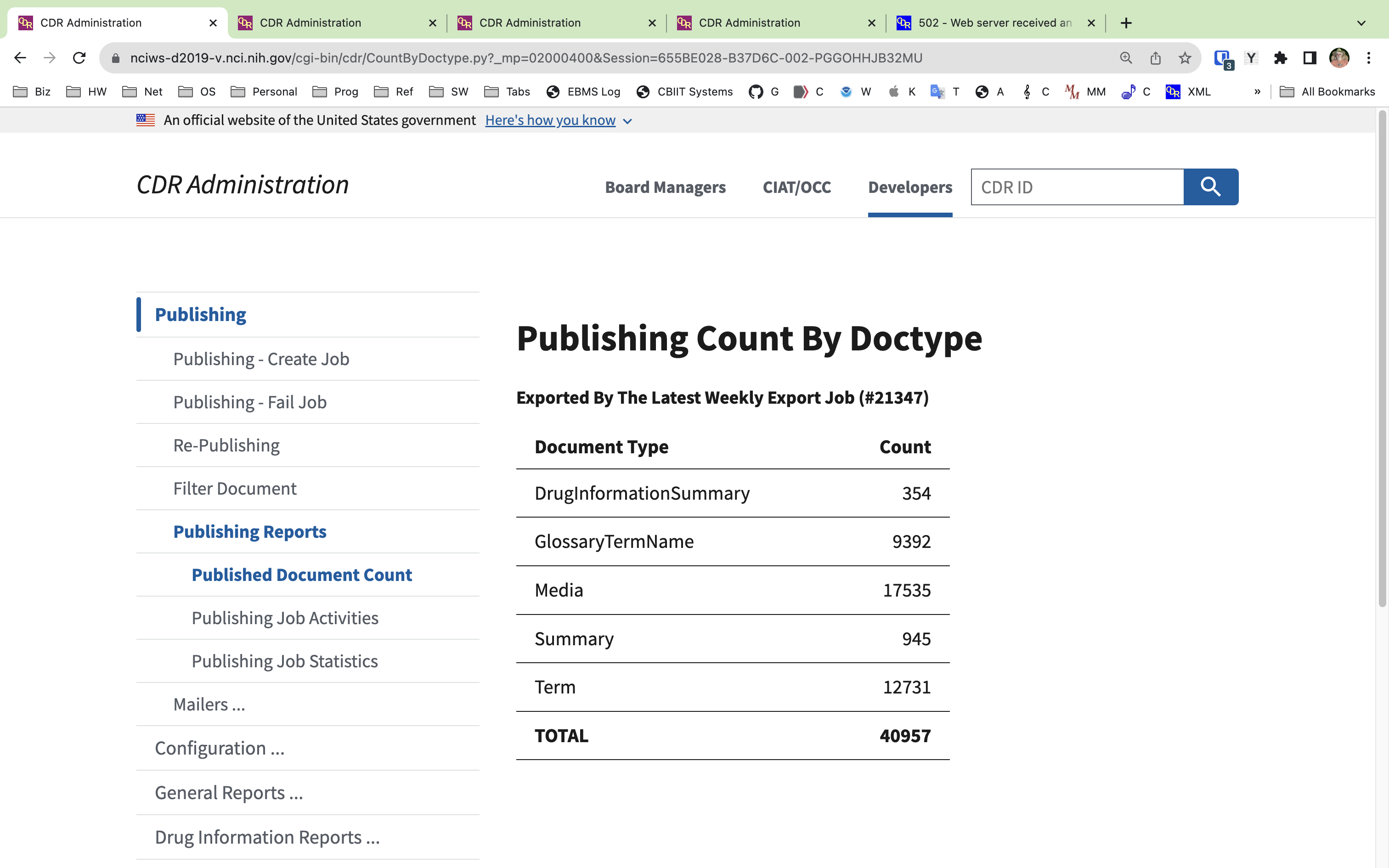
Standard report layout
Most reports will need more space, and will be displayed in their own tab, without the left navigation sidebar.
Wide report layout
Some reports have enough columns that they require more space than is available within the layout's grid framework. These reports are given the width of the full browser window.
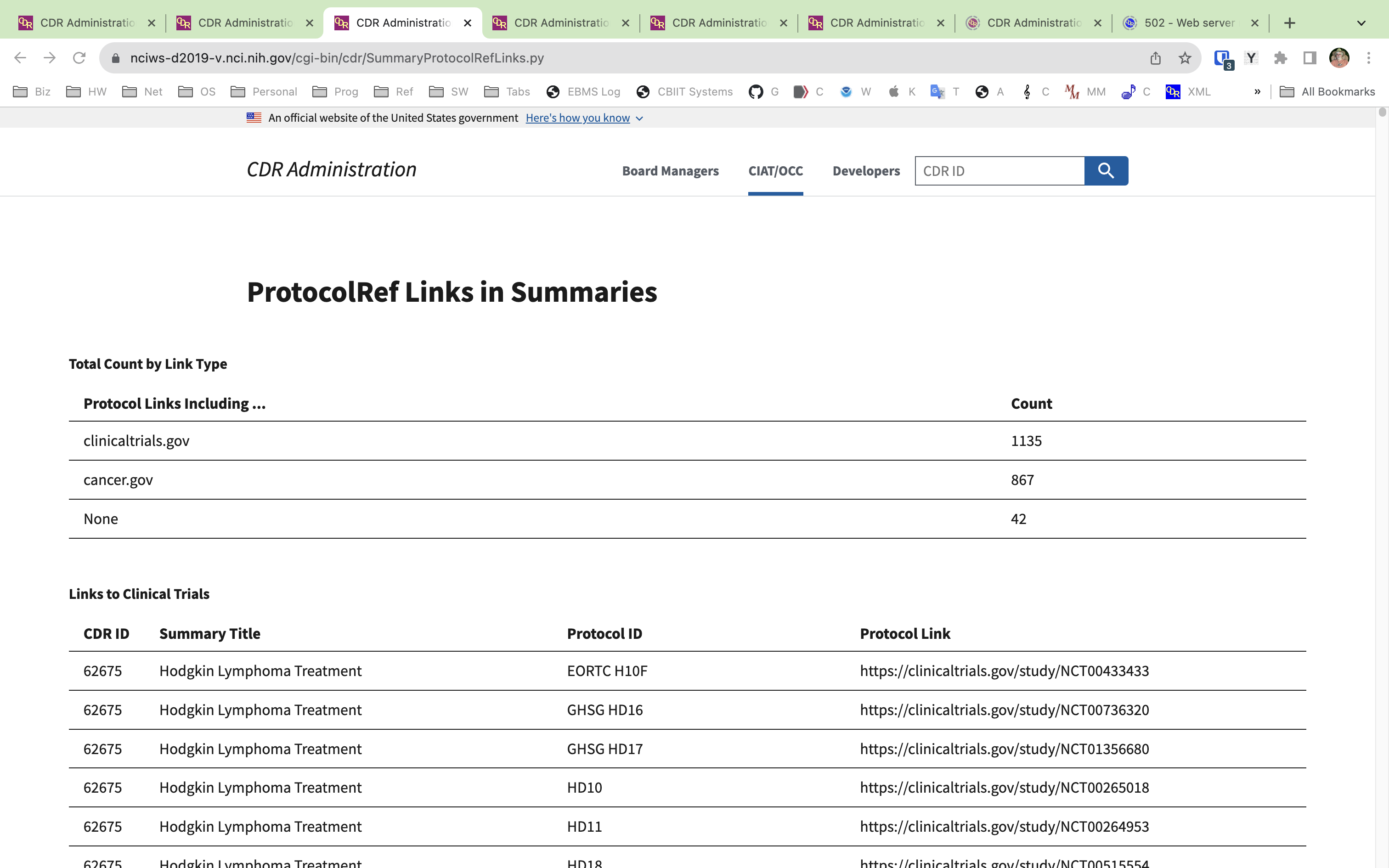
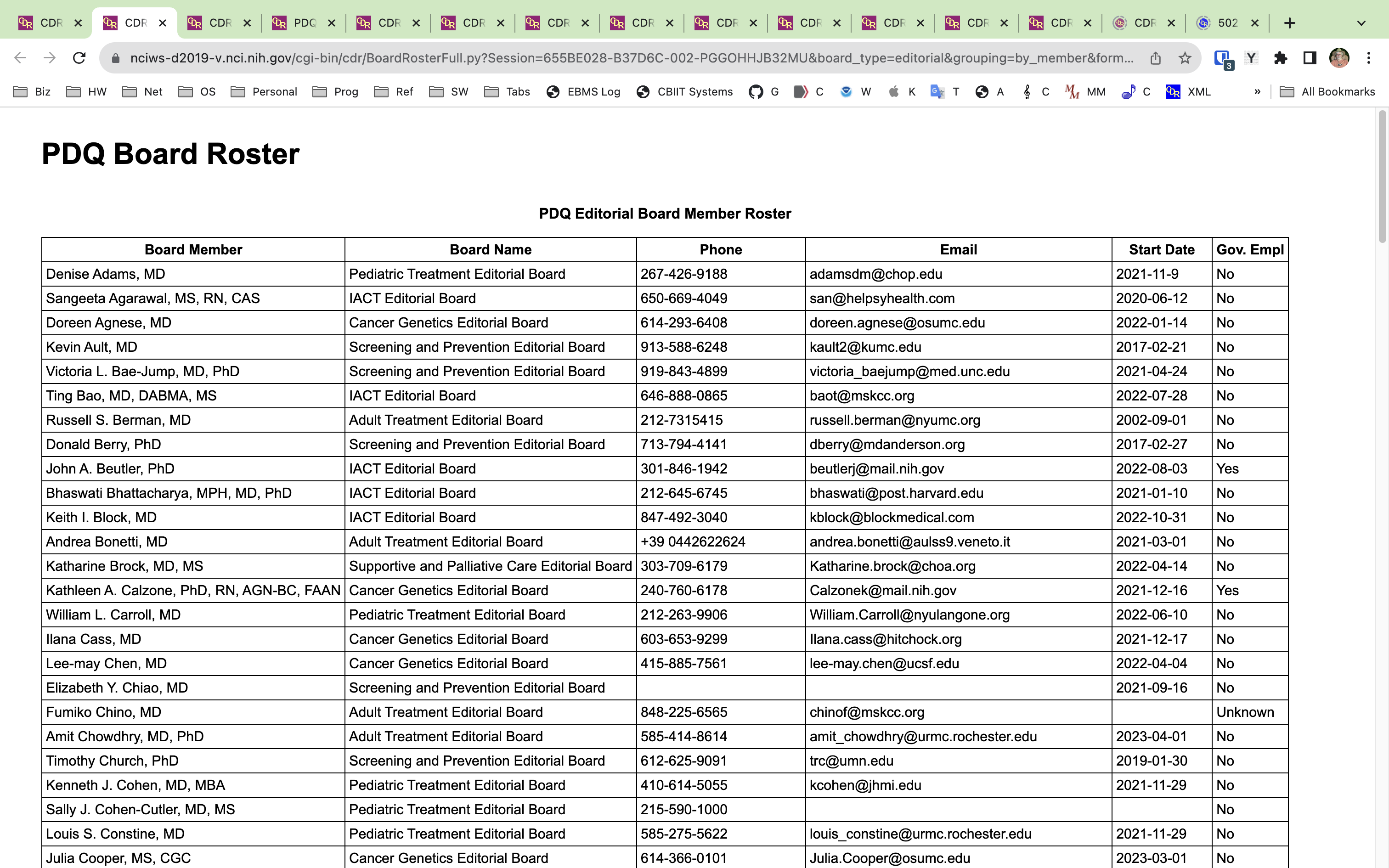
Plain layout reports
There are a number of reports which have so many columns that they need to be displayed without the standard USWDS framework. For reports which have too many columns to comfortably fit on a browser page, an Excel-only report is often the best option.
Custom report layouts
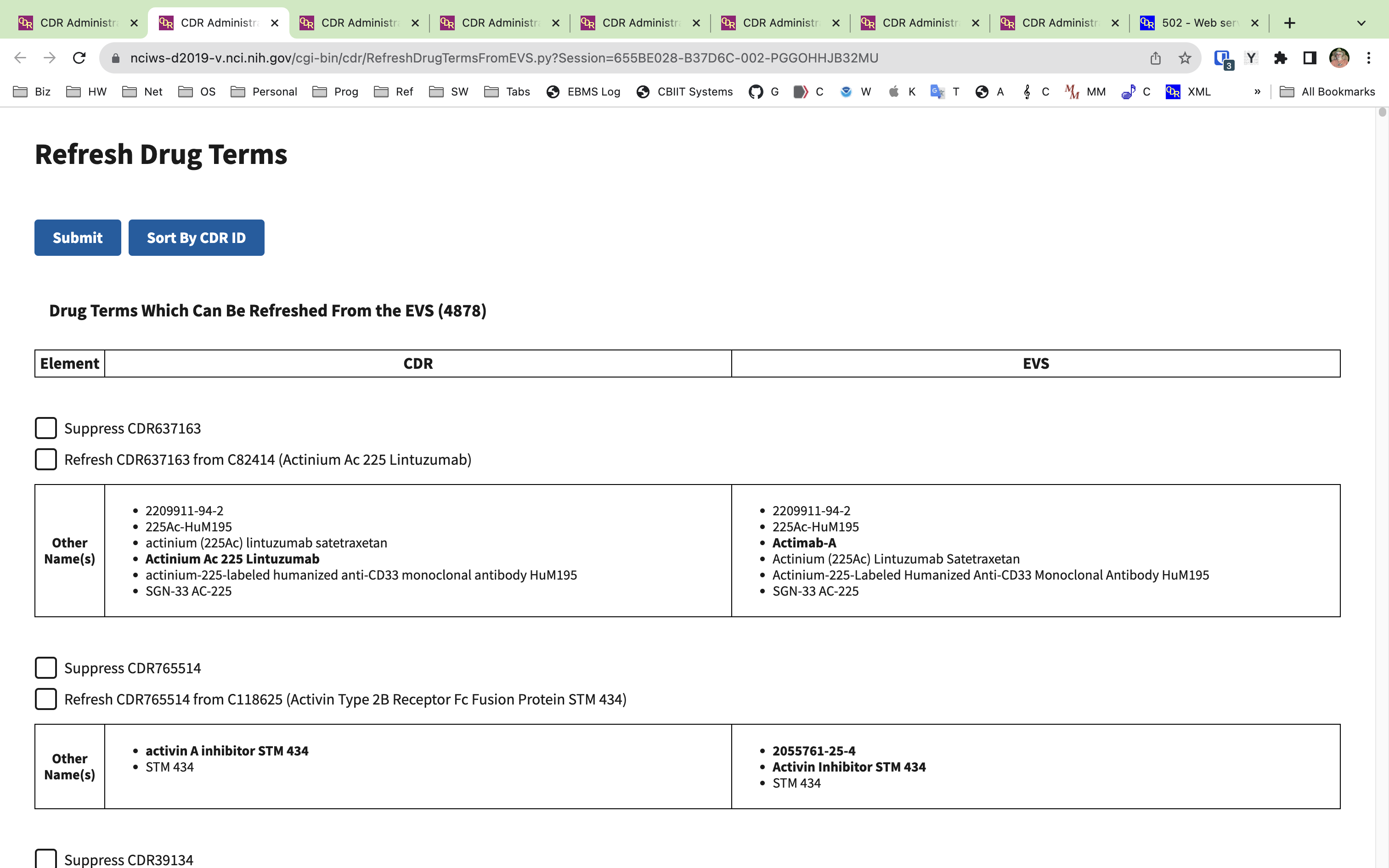
Some reports are really processing forms, and require non-standard table layouts.
Notification alert banners
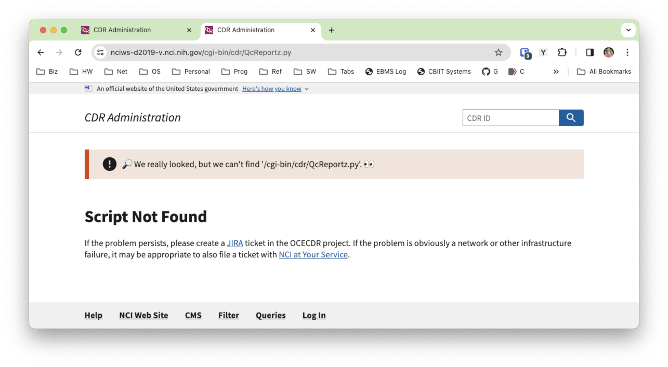
Many of the places where a problem was encountered for a report request now show one ore more alert banners explaining the problem(s) above the re-displayed form, allowing the user to correct the errors directly instead of needing to navigate back to the original form.
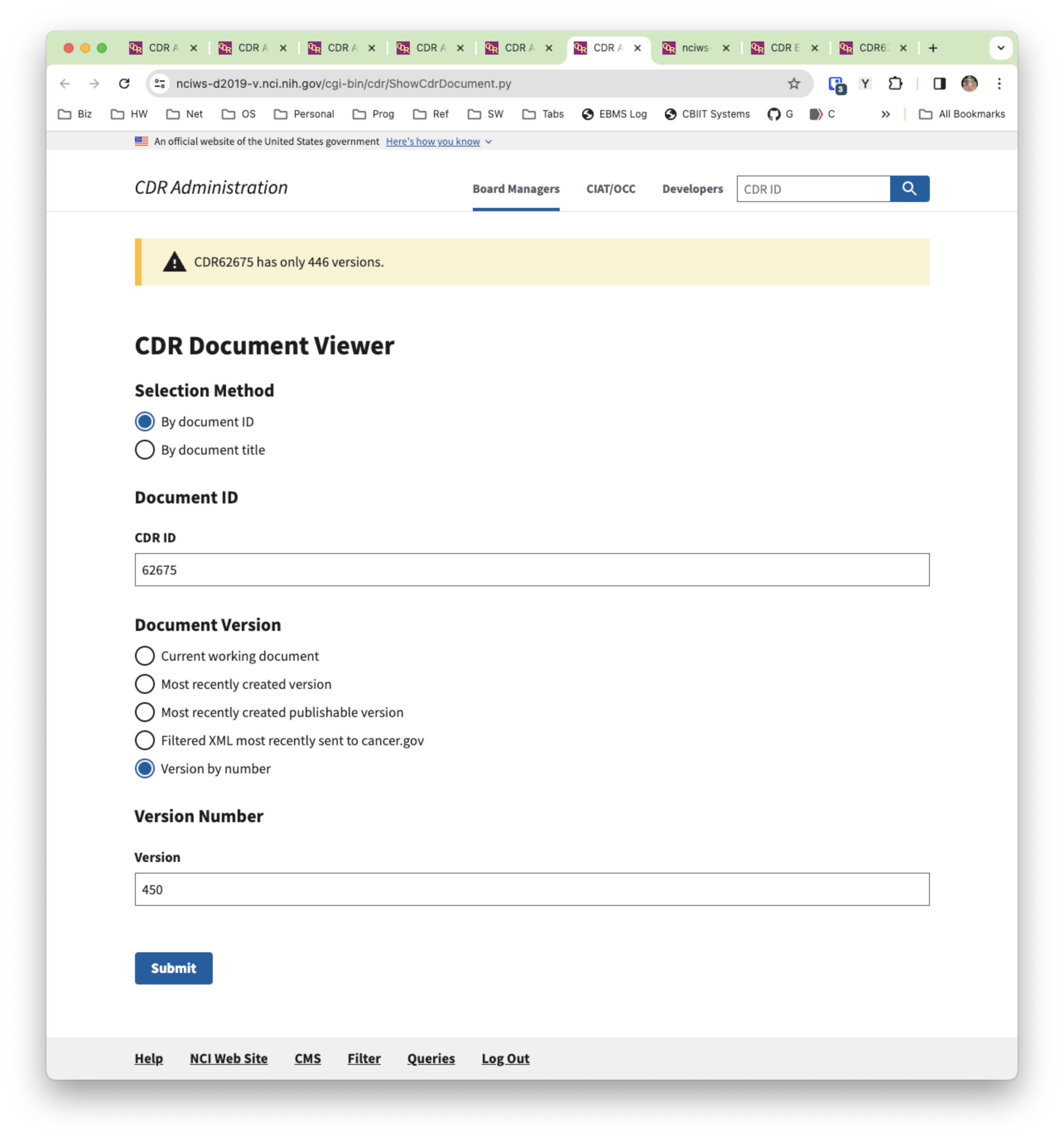
The same banner system is used to replace the ugly and uninformative 502 - Web server received an invalid response while acting as a gateway or proxy server messages.
(re-entry of a comment which JIRA discarded)
A complete set of automated tests has been created for the new admin pages. There are ten groups of tests, each of which can be run separately or in combination (as can the individual tests themselves). There are 160 tests in all, some of which cover more than one page (there are 180 unique pages in the admin menus). A complete run of all the tests takes about an hour and 20 minutes. Currently all the tests pass. The test groups:
CitationTests
DeveloperTests
DrugTests
GeneralTests
GlossaryTests
ManagementTests
MediaTests
PublishingTests
SummaryTests
TerminologyTests
This has been installed on CDR DEV.
I've added a "Menus" link to the footer, which will let you see the hierarchies of the left nav menus. ~oseipokuw this might be the cheat sheet your staff needs for learning their way around. Hope this helps. 🙂
I just thought of another advantage of the new menu system for the updated UI. I can configure it so that we can modify the menus without a release, moving things around (or dropping them) as we need to.
On the landing page there is the entry "Logged in users". Does the number displayed indicate the number of users logged in including myself?
Yes. I believe it also includes the guest account. Perhaps I
should eliminate that one from the count.
[Edit: Turns out I already did that. So no, the guest account is not included. But yes, it does include yourself.]
I would like the spelling for one of the menu items to be adjusted, if possible. It is the menu item
Rôles and Permissions ...
I am aware that "Rôle" is an accepted spelling of the word but it is the less common form. I suggest to use the more common form and spell the menu
Roles and Permissions...
Done.
Looking at the scheduled jobs page, I have to say that I find the old table view a lot easier to read than the new list view. Maybe we can get something similar again in another iteration?
Sure, we can revisit the design of this page. I was balancing the choices of coming up with a layout for the list of jobs which would fit on the page alongside the left nav menu versus introducing an extra step of rendering an intermediate page displaying documentation for how the scheduler works with a link that would open a wider table in a separate tab without the left nav menu panel and therefore with more real estate for the jobs table. I went with the more efficient (fewer clicks) choice, but that's not a hill I would choose to die on. Separating the jobs into two piles was another change. This had two benefits: (1) it gave a quicker answer to the question "which jobs are currently scheduled to run?"; and (2) it eliminated the need to use up real estate in the space for each individual job to say whether the job is enabled or disabled. Again, that's a decision we can discuss. Put in a ticket, giving specific ideas on how you envision this page looking and we can for sure do another iteration on this. 👍
Verified on QA. Thanks!
| File Name | Posted | User |
|---|---|---|
| form-error.png | 2023-12-18 05:04:49 | Kline, Bob (NIH/NCI) [C] |
| in-place-report.png | 2023-12-18 03:48:06 | Kline, Bob (NIH/NCI) [C] |
| landing-page.png | 2023-12-18 03:35:18 | Kline, Bob (NIH/NCI) [C] |
| navigation-sidebar.png | 2023-12-18 03:50:09 | Kline, Bob (NIH/NCI) [C] |
| report-basic-page.png | 2023-12-18 03:49:11 | Kline, Bob (NIH/NCI) [C] |
| report-container-width.png | 2023-12-18 03:48:49 | Kline, Bob (NIH/NCI) [C] |
| report-custom.png | 2023-12-18 03:49:21 | Kline, Bob (NIH/NCI) [C] |
| report-full-page-width.png | 2023-12-18 03:48:58 | Kline, Bob (NIH/NCI) [C] |
| script-not-found.png | 2023-12-18 04:19:54 | Kline, Bob (NIH/NCI) [C] |
Elapsed: 0:00:00.001314